Introduction
In this tutorial, we'll explore how to build an interactive Profile Card using React and Tailwind CSS. We'll walk through the process of creating a user interface with smooth animations, a cancel sound effect, and a blur effect. The final result will be a visually appealing and engaging profile card that can be easily customized and extended.
Getting Started
To begin, let's set up our development environment by creating a new React project. Open your preferred code editor and follow these steps:
Create a new directory for your project.
Open a terminal and navigate to the project directory.
Run the following command to create a new React app:
npx create-react-app profile-card
- Once the project is created, navigate to the project directory:
cd profile-card
- Next, install the required dependencies:
npm install tailwindcss
- We also need to configure Tailwind CSS. Run the following command to generate the default configuration file:
npx tailwindcss init
- Open the
tailwind.config.jsfile and customize the configuration according to your preferences or project requirements.
Building the Profile Card
Now that we have our project set up, let's dive into the code and start building the Profile Card.
- First, import the required assets and CSS styles by adding the following lines to the
App.jsfile:
import closeSound from './close.mp3';
import './App.css';
- Define the functional component
App()and add the necessary functions to handle card opening and closing:
function App() {
  const openCard = () => {
    // Code to open the card and apply animation effects
  };

  const closee = () => {
    // Code to close the card and apply animation effects
  };

  // JSX code for the Profile Card Dashboard UI

  return (
    // JSX code for the Profile Card Dashboard UI
  );
}

export default App;
Implement the JSX code to create the UI for the Profile Card. Use the provided UI code from the given user interface or customize it according to your preferences. The UI should include the necessary HTML elements and Tailwind CSS classes to style the components.
Inside the JSX code, add the necessary event handlers to the respective elements. For example, attach the
openCardfunction to theonClickevent of the profile image to open the card when clicked.Similarly, attach the
closeefunction to theonClickevent of the "Close" button to close the card.Inside the
openCardfunction, usedocument.getElementById()to access the required elements and apply CSS styles to create the desired animation effects. For example, modify thedisplay,zIndex,filter, andtransformproperties of the card and container elements to open the card and blur the background.Inside the
closeefunction, usedocument.getElementById()to access the required elements and modify their CSS properties to close the card and remove the blur effect. Additionally, use theaudioelement to play the close sound effect.
Friendly reminder: Have you had enough water today? If not, have a glass of water and continue reading 😇!
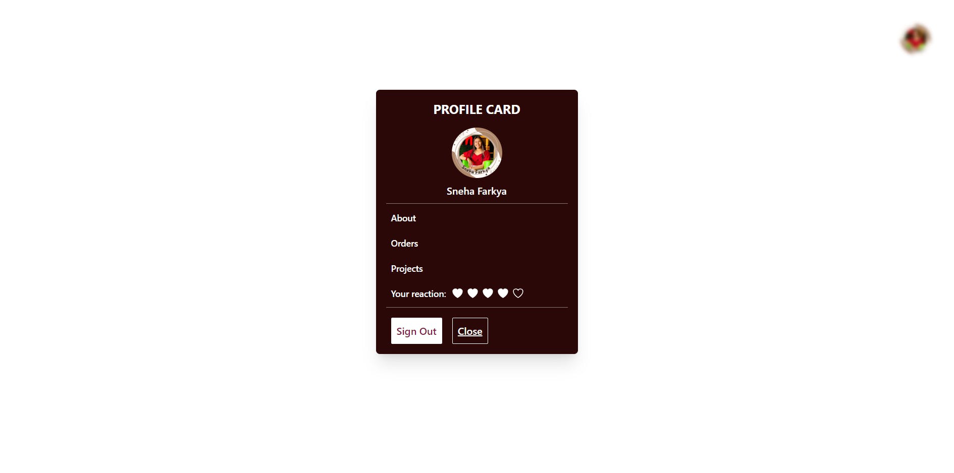
How will it look:
This is how our profile card will look. You can check the code here.

A live preview is available here.
Conclusion
Congratulations! You have successfully built a dynamic Profile Card using React and Tailwind CSS. By following this tutorial, you've learned how to create smooth animations, incorporate a cancel/close sound effect, and apply a blur effect to enhance the user experience. Feel free to customize and extend this dashboard card further to suit your specific project requirements.
Remember to optimize and refactor your code as needed, ensuring clean and maintainable code practices.
If you liked my work, do follow me for more✨. You can check out my links here
Happy Coding!