Customizing React Select DROPDOWN Component

This is Sneha Farkya from India. I am a front-end developer and technical writer with a strong interest in creating interactive and visually appealing web interfaces. I am constantly exploring new technologies and keeping up with the latest trends. I like to solve people's problems and believe in giving bac to community
It's good to see you here. I am happy that such a curious person exists!
Have you ever faced difficulties in making a custom dropdown? I'm sure you have at some point in time! I did face this issue a couple of times, and then I figured out this amazing library.
Please buckle up, I'm going to give you the best solution. Have you heard about react-select? Read below to know more about it.
Throwing light on React-select
React-Select is a popular and versatile library in the React ecosystem that simplifies the implementation of dropdown components. It gives you a variety of customization be it the dropdown options or input field. In this article, we will explore how to use the React-Select library to create a customizable dropdown component, using the provided code as an example.
Getting Started
Before diving into the details, make sure you have React and React-Select installed in your project. We are going to build this using React js.
Create a new react app react-select-dropdown
npx create-react-app react-select-dropdown
cd react-select-dropdown
Now, let's examine the sample code that includes the integration of React-Select into a React application.
import React from 'react';
import './App.css';
import SelectDropdown from './selectDropdown';

function App() {
  return (
    <div className="App">
      <header className="App-header">
        <h4>This is the illustration of the React-Select dropdown component. It allows you to customize it according to your preferences.</h4>
        <SelectDropdown />
        <div className="footer">
          <h5>Connect with me here: <a href="https://linktr.ee/sneha_farkya">Sneha Farkya</a></h5>
        </div>
      </header>
    </div>
  );
}

export default App;
Understanding the Code
1. Importing Dependencies
The code begins by importing necessary dependencies. React, logo, and styles from App.css are imported, along with the custom SelectDropdown component.
2. App Component
The App component is the root component of the application. Inside its render method, there is a structure representing the application layout.
3. Header Section
Within the header section, there is a heading (<h4>) providing an overview of the React-Select dropdown component. This is followed by the inclusion of the SelectDropdown component.
4. SelectDropdown Component
The SelectDropdown component is where the React-Select library is utilized. This component, which is expected to be defined elsewhere in your project, encapsulates the dropdown functionality.
5. Footer Section
Finally, the footer section includes a link for connecting with the author.
Creating a Custom Dropdown with React-Select
Component Structure
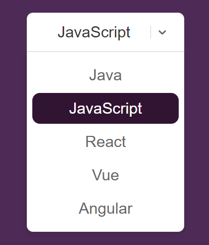
The SelectDropdown component begins by defining an array of options representing programming languages. Each option has a value and label property, making it easy to handle selected values. The component then proceeds to define a set of custom styles for the React-Select components. This is how our dropdown is going to look like!
Understanding the Code
1. Options Array:
The options array contains a list of programming languages with corresponding values and labels. This array serves as the data source for the dropdown options.
const options = [
  { value: 'java', label: 'Java' },
  { value: 'javascript', label: 'JavaScript' },
  { value: 'React', label: 'React' },
  { value: 'vue', label: 'Vue' },
  { value: 'Angular', label: 'Angular' },
];
2. Custom Styles:
The customStyles object defines various styles for different components of the React-Select dropdown. These styles enhance the visual appeal and responsiveness of the dropdown.
 const customStyles = {
    control: (baseStyles, state) => ({
      ...baseStyles,
      borderRadius:'10px',
      padding:'12px 16px',
      border: '1px solid rgba(0, 0, 0, 0.10);',
      borderBottomLeftRadius:'0px',
      borderBottomRightRadius:'0px',
      borderColor:state.isFocused?'transparent':0,
      outline:state.isFocused?'none !important':'none !important',
      boxShadow:'none',
      overflow:'hidden',
      zIndex:'9',
      ":hover": {border : '1px solid rgba(0, 0, 0, 0.10);'}
    }),
    option: (provided, state) => ({
      ...provided,
      marginTop:'-4px',
      marginBottom:'8px',
      borderRadius:"12px",
      padding:'10px 16px',
      color: state.isSelected? 'white': '#666666',
      background: state.isSelected ? '#311432' : 'transparent',
      fontWeight:'500',
      ":hover":{background : '#311432', color:'white', },
      ":focus": {background:'#311432', color:'white'},
      transition:"all 0.3s ease-in-out",
    }),
    menu: (provided, state) => ({
      ...provided,
      marginTop:'0px',
      borderRadius:'10px',
      borderTopRightRadius:'0px',
      borderTopLeftRadius:'0px',
      padding:'12px 8px 0px 8px',
      overflow:'hidden',
      border:'1px solid rgba(0, 0, 0, 0.10);',
    }),

    placeholder: (provided, state) => ({
      ...provided,
      color:'#666666',
      fontWeight:'500',
      fontSize:'16px',
      opacity:'50%',
      border:'none'
    }),
    input: (provided, state) => ({
      ...provided,
      borderColor:state.isFocused?'yellow' :'none',
      ringColor:state.isFocused?'none' :'none',
      outline: state.isFocused?'none' :'none',
      padding:'0px',
    }),
  }
Control Style:
Adjusts border-radius, padding, and border properties for the main control element.
Manages focus and hover effects for a seamless user interaction.
Option Style:
Defines padding, margin, and background styles for individual options.
Handles color changes based on selection, hover, and focus states.
Menu Style:
- Customizes padding, border radius, and overflow properties for the dropdown menu.
Placeholder Style:
- Specifies styles for the placeholder text, such as color, font weight, and opacity.
Input Style:
- Manages border color, focus effects, and padding for the input field.
3. Rendering the Dropdown:
The SelectDropdown component renders the React-Select component, incorporating the defined options, default value, custom styles, and additional props. Check out the live preview here: Preview link
return (
  <div className='select-component'>
    <Select options={options} defaultValue={options[1]} styles={customStyles} className="custom-select" isSearchable={false} />
  </div>
);
Conclusion
The SelectDropdown component provides a robust example of how React-Select can be harnessed to create a tailored dropdown experience. The thoughtful customization of styles not only enhances the visual appeal but also ensures seamless and intuitive user interaction.
Developers can leverage this code as a foundation and further customize it to suit the specific needs and aesthetics of their projects. By exploring the intricacies of this code, developers can gain valuable insights into harnessing the full potential of React-Select for creating unique and user-friendly dropdown components in React applications.